The question
How can a career portal help people find an opportunity without making them decode the organization?
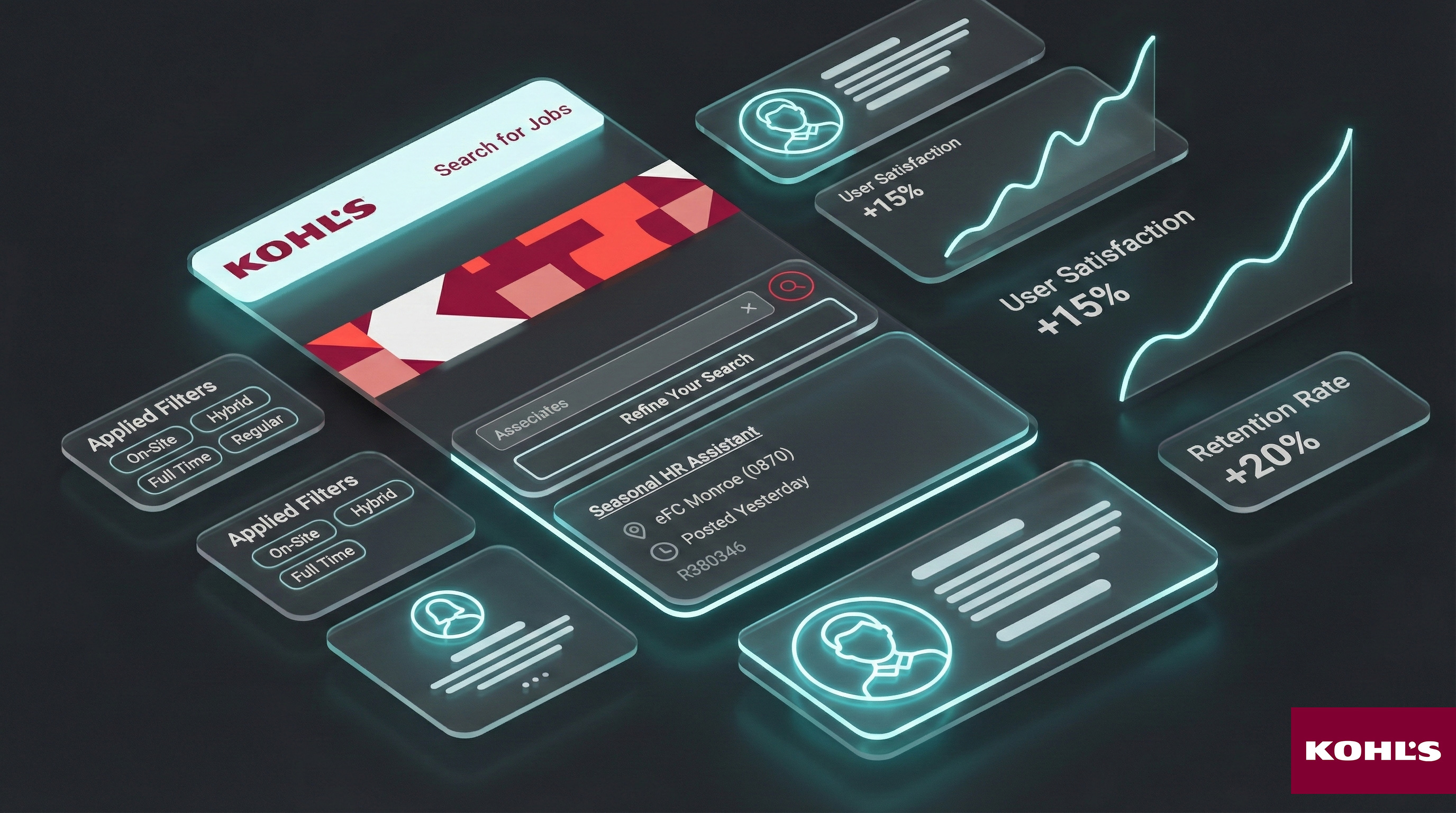
The Workday career landing page served people exploring roles and career resources. Confusing labels, competing navigation paths, and dense content made basic information difficult to find. My research connected employee feedback with observed behavior and analytics to guide changes within the existing platform.
My approach
How I worked through it.
Establish where the experience breaks down
I combined an expert review and competitive benchmarking with surveys, interviews, and usability testing. This connected visible interface issues to the tasks and expectations of prospective applicants and current employees.
Use behavior to challenge assumptions
I paired qualitative feedback with navigation and engagement data. The work focused on where users looked, which labels made sense, and where they abandoned a path.
Iterate within the platform
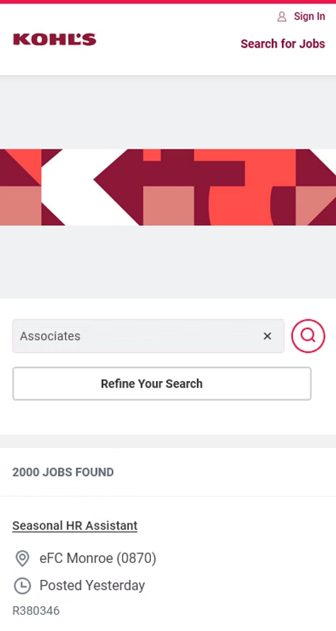
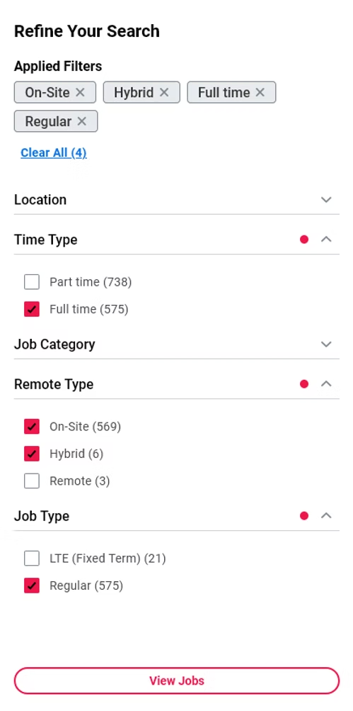
Research informed clearer information architecture, more direct job-search pathways, shorter content blocks, and stronger visual consistency. Prototypes and usability testing helped evaluate the proposed direction.
Evidence to decisions
What mattered. What it changed.
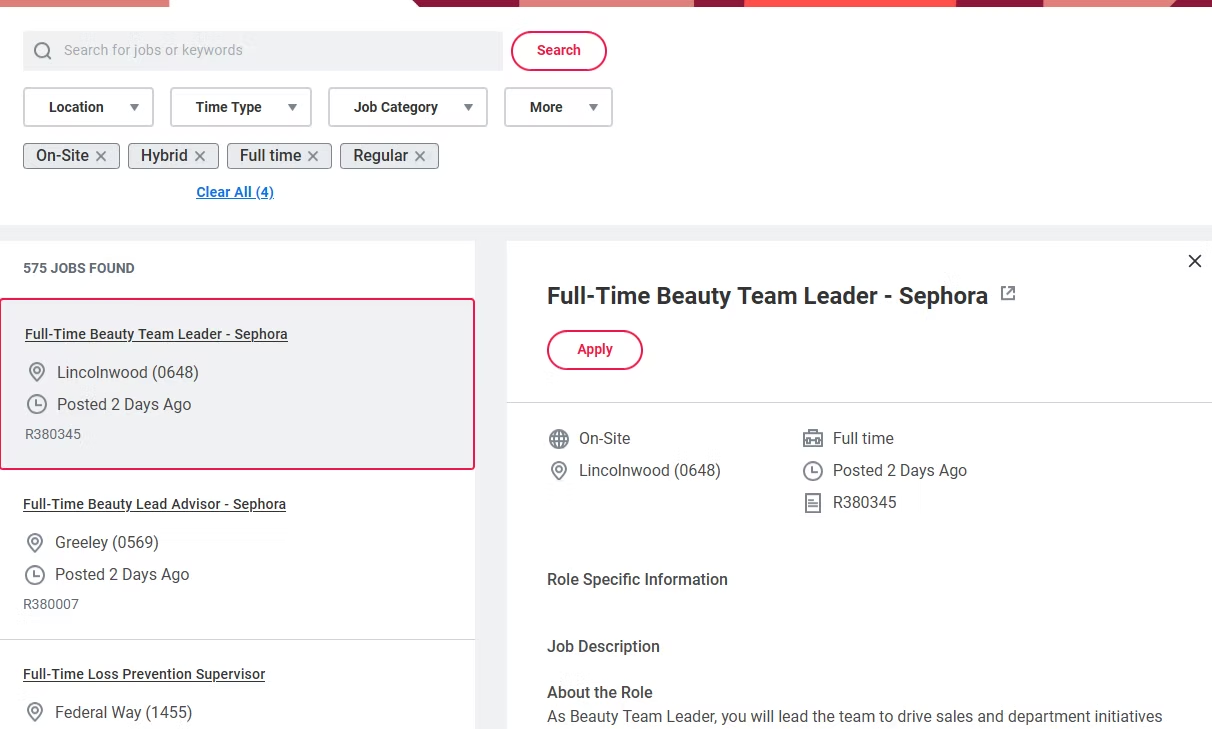
Too many routes obscured the main task
Competing links and unclear labels made it harder to reach job listings and supporting information.
Design directionGive job search clear priority and use language drawn from user research.
Internal and external visitors needed different context
Current employees and prospective applicants approached the page with different expectations about opportunities and next steps.
Design directionOrganize supporting content around the visitor’s task rather than an internal organizational taxonomy.
Visual consistency supported confidence
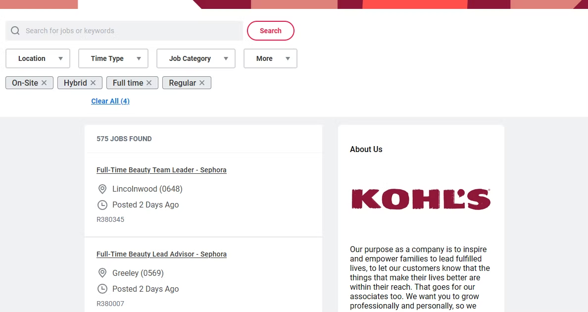
The career experience did not consistently reflect the broader employer brand.
Design directionAlign the page’s hierarchy, imagery, and content with the brand while working within Workday’s constraints.

Contribution and outcome
Higher satisfaction and a more direct career-search experience.
The work informed a clearer navigation hierarchy, more direct job-search pathways, and shorter supporting content within Workday. Reported redesign outcomes included 15% higher satisfaction, an 8% lower bounce rate, and 12% less time to find information.
How to read the outcome
These figures describe reported changes following the redesign. They do not isolate the effect of research from other product changes.
Reflection
Platform constraints made prioritization essential. Clear labels and a more direct route to the primary task could have more value than a larger visual change.Let’s talk through the work